Cross-posted from Coyoteblog.
There was some debate a while back around about a temperature chart some Conservative groups were passing around.

Obviously, on this scale, global warming does not look too scary. The question is, is this scale at all relevant? I could re-scale the 1929 stock market drop to a chart that goes from Dow 0 to, say, Dow 100,000 and the drop would hardly be noticeable. That re-scaling wouldn’t change the fact that the 1929 stock market crash was incredibly meaningful and had large impacts on the economy. Kevin Drum wrote about the temperature chart above,
This is so phenomenally stupid that I figured it had to be a joke of some kind.
Mother Jones has banned me from commenting on Drum’s site, so I could not participate in the conversation over this chart. But I thought about it for a while, and I think the chart’s author perhaps has a point but pulled it off poorly. I am going to take another shot at it.
First, I always show the historic temperature anomaly on the zoomed in scale that you are used to seeing, e.g. (as usual, click to enlarge)
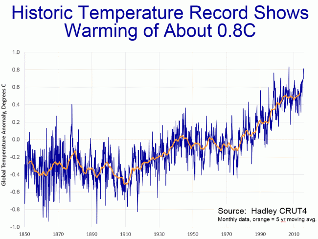
The problem with this chart is that it is utterly without context just as much as the previous chart. Is 0.8C a lot or a little? Going back to our stock market analogy, it’s a bit like showing the recent daily fluctuations of the Dow on a scale from 16,300 to 16,350. The variations will look huge, much larger than either their percentage variation or their meaningfulness to all but the most panicky investors.
So I have started including the chart below as well. Note that it is in Fahrenheit (vs. the anomaly chart above in Celsius) because US audiences have a better intuition for Fahrenheit, and is only for the US vs. the global chart above. It shows the range of variation in US monthly averages, with the orange being the monthly average daily maximum temperature across the US, the dark blue showing the monthly average daily minimum temperature, and the green the monthly mean. The dotted line is the long-term linear trend
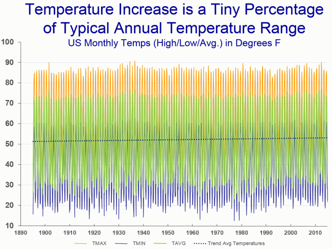
Note that these are the US averages — the full range of daily maximums and minimums for the US as a whole would be wider and the full range of individual location temperatures would be wider still. A couple of observations:
- It is always dangerous to eyeball charts, but you should be able to see what is well known to climate scientists (and not just some skeptic fever dream) — that much of the increase over the last 30 years (and even 100 years) of average temperatures has come not from higher daytime highs but from higher nighttime minimum temperatures. This is one reason skeptics often roll their eyes as attribution of 15 degree summer daytime record heat waves to global warming, since the majority of the global warming signal can actually be found with winter and nighttime temperatures.
- The other reason skeptics roll their eyes at attribution of 15 degree heat waves to 1 degree long term trends is that this one degree trend is trivial compared to the natural variation found in intra-day temperatures, between seasons, or even across years. It is for this context that I think this view of temperature trends is useful as a supplement to traditional anomaly charts (in my standard presentation, I show this chart scale once and the standard anomaly chart scale further up about 30 times, so that utility has limits).